Chapter six from Reading
Images, written by Gunther Kress and Theo van Leeuwen, discusses “The
Meaning of Composition” in images, advertisements, television shows, and other
mediums. Kress and van Leeuween
make several convincing arguments regarding the composition of images that we
see on a daily basis. I had never
heard of the “rules” they advocate, and after researching a bit I found it
difficult to accept their theory.
Kress and van Leeuween argue “a theory of language is no
longer sufficient and must be complemented by theories which can make the
principles of the new visual literacy explicit” (Kress). They address their theories with three
directives of composition. According
to the authors, “Composition…relates the representational and interactive
meanings of the image to each other through three interrelated systems”
(Kress):
- Information Value: The location of images associate them with their informational value
- Salience: The images must draw the attention of viewers and prove their relevance
- Framing: Including or omitting framing devices shows importance to other items nearby
In some mediums with a divide down the middle of
the image, the left side of the image is the “given” and the right side is the
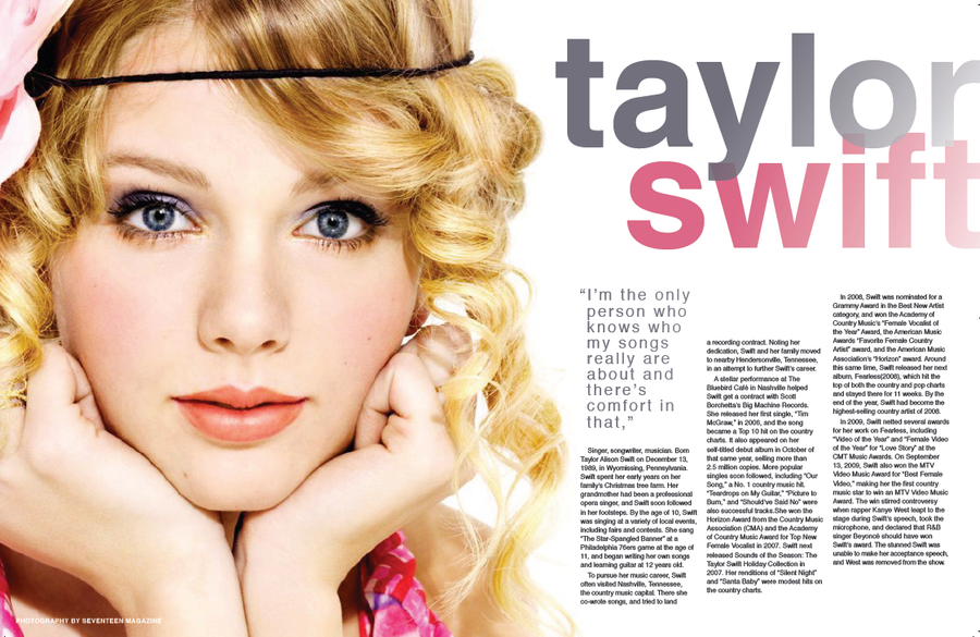
“new.” For instance, in this
Taylor Swift feature in Seventeen Magazine, the singer is placed on the left
side of the page as a familiar face, while the article and new information on
the music star are on the right.
However, there are plenty of popular images that do not fit
within the constraints of the authors’ rules. Oprah, Jay Leno, Jimmy Fallon, anchors on CNN, magazine
spreads in Vogue, and the like do not follow this theory. In fact, I had a more difficult time
finding images that did fit into the
criteria than those that did not. Do you think the authors’ theory is
followed or merely a suggestion of how images should be compiled? Are
images that do not fit within the constraints of the theory as aesthetically
pleasing to you as images that do? See below examples that defy the theory set out by Kress and van Leeuwen.
 |
| Vogue Magazine spread |
 |
| Nike advertisement |
No comments:
Post a Comment