Wednesday, October 9, 2013

Is Less Really More?


Virilio’s Part II of Open Sky takes on more manageable topics for the everyday audience.  One of his major points reads: “If the recent evolution of post-industrial machinery is anything to go by: less is more” (54). 

Virilio is commenting on our industrialization as a society and how more is not always better.  For example, iPhones, televisions, radios, all of this new technology…is it beneficial to our society? Or detrimental to our livelihood?    

Ultimately, “The burning question is: if less is more, to what extent?” (54).  What justifies as enough?  If people really were happy with less, as opposed to more, why do inventors continue to expand their horizons and improve technology?

I can assure you that Apple isn’t planning to discontinue innovations anytime soon and Toyota is going to continue to continue to make more efficient hybrid cars for consumers.  What Virilio is overlooking is the consumer.  If there is a market for products that are bigger and better and more high tech, I would presume there will be an audience that wants such a product.

The last ever MacBook?
If we all have “enough,” what more is there to strive for?  Without aspirations of achieving greatness, I would argue that society, as a whole would become unproductive and complacent.  Our relentless attitudes and determined spirit is what we, as a society, utilize in order to keep moving forward.  

Monday, October 7, 2013

Time as a State of Mind


Beginning Part I of Paul Virilio’s Open Sky was an eye opener.  Not only because of its difficulty to understand, but once I conquered the language barrier, I learned what Virilio has to say is fairly radical.     

Part I is based on the idea of time and an individual’s time in a specific space.  He dictates the importance (or lack thereof) of near and far, and here and now.  While these spaces of time may have been important previously, Virilio asserts that soon there will be no difference between these spaces. 

For instance, teleportation is not far off when telecommunication (such as conference calls) is a medium of today.  Business executives in Hong Kong can videoconference the chief executive officer of a major corporation in New York City to discuss international trade.  Consequently, the businessman in the United States is in two places at once, as is the foreign trader.  These assumptions erase the present man, and take their position as telepresence and tele-existence.  Can we really be two places at once, even if only via technology?

I believe the most drastic claim Virilio makes is in his last few pages of the section. He states: “Whether we like it or not, for each and every one of us there is now a split in the representation of the World and so in its reality,” (44).  Has our world, specifically how we view the world, changed this drastically?  Virilio believes it has, but what argument does he make for this dramatic division? 

Maybe there is a drastic divide between reality and how we represent reality, but can we go as far to say there are two separate realities?  Virilio thinks we can.  I’m not completely convinced that our means of communication and technology can intermix so far as to create separate realities, but I will be interested to see how the rest of his argument pans out.

He concludes, “We thus find ourselves faced with a sort of great divide in knowing how to be in the world,” a task that may be more difficult than we imagined (25).  We must determine whether we will exist as a civilian or as a nomad on a journey.  For Virilio, it is this decision that determines how we will interpret representations and reality in the future.       

Wednesday, October 2, 2013

Before and After: Technology at Furman


Before: Dark glow


After: Brighter, sharper

Before: Overexposed
After: Darker Contrast, All Black Screens
Before: Overexposed, Wide Shot

After: Zoomed in, Colors Darkened
Before: Wide Shot, Bright Image


After: Cropped, More Contrast


Before: Underexposed
After: Brightness increased, T added

Technology at Furman


Created with flickr slideshow.

Monday, September 30, 2013

Composition Matters...Or Does it?


Chapter six from Reading Images, written by Gunther Kress and Theo van Leeuwen, discusses “The Meaning of Composition” in images, advertisements, television shows, and other mediums.  Kress and van Leeuween make several convincing arguments regarding the composition of images that we see on a daily basis.  I had never heard of the “rules” they advocate, and after researching a bit I found it difficult to accept their theory.

Kress and van Leeuween argue “a theory of language is no longer sufficient and must be complemented by theories which can make the principles of the new visual literacy explicit” (Kress).  They address their theories with three directives of composition.  According to the authors, “Composition…relates the representational and interactive meanings of the image to each other through three interrelated systems” (Kress):
  1.  Information Value: The location of images associate them with their informational value
  2. Salience: The images must draw the attention of viewers and prove their relevance
  3. Framing: Including or omitting framing devices shows importance to other items nearby

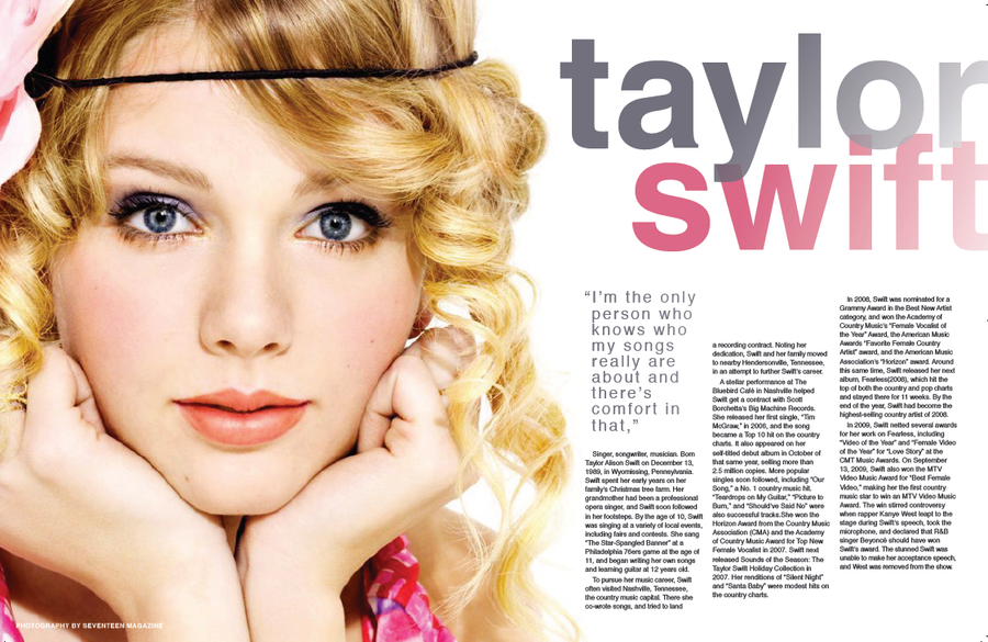
In some mediums with a divide down the middle of the image, the left side of the image is the “given” and the right side is the “new.”  For instance, in this Taylor Swift feature in Seventeen Magazine, the singer is placed on the left side of the page as a familiar face, while the article and new information on the music star are on the right.


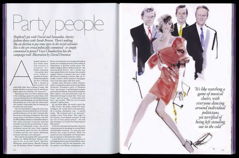
However, there are plenty of popular images that do not fit within the constraints of the authors’ rules.  Oprah, Jay Leno, Jimmy Fallon, anchors on CNN, magazine spreads in Vogue, and the like do not follow this theory.  In fact, I had a more difficult time finding images that did fit into the criteria than those that did not.  Do you think the authors’ theory is followed or merely a suggestion of how images should be compiled?  Are images that do not fit within the constraints of the theory as aesthetically pleasing to you as images that do? See below examples that defy the theory set out by Kress and van Leeuwen.
 
Vogue Magazine spread


Nike advertisement

Wednesday, September 25, 2013

A Culture Built on Capital


In their chapter “Viewers Make Meaning,” Sturken and Cartwright decipher how audiences uniquely analyze images they see.  They determine that images interpellate viewers and of noteworthiness is how audiences interpellate, defined as “to interrupt a procedure in order to question someone or something formally,” (50).  We, as viewers, are interpellated when viewing a commercial, advertisement, piece of artwork, or billboard.  We are forced to wonder what the purpose of the image is, how it got there, and what it should mean to us.    

Two things that all viewer interpretations involve are aesthetics and taste (56).  Aesthetics rely on one’s analysis of an image’s style or beauty, while taste is a cultural reference.  Taste can be varied among viewers depending upon one’s class, cultural background, or education.  The authors allude to this as a matter of “cultural capital” (60).  This creates a divide between highbrow cultures and lowbrow cultures.  For example, look at Andy Warhol’s “Campbell’s Soup Cans.”


The Warhol print gained notoriety among ordinary people as his art sought to shed a positive light on the novelties of common things.  In my eyes, “Campbell’s Soup Cans” represent a modern, universal message for those of a different societal class than previous artists had sought after.  The Product Marketing Manager even wrote Warhol a note expressing his gratitude and appreciation for the artist along with a case of Tomato Soup!  People could finally relate to this kind of artwork, in a way that only highbrow viewers could previously to artists such as Monet and Van Gogh.  Warhol gave cultural significance to an ordinary class of people that formerly could only dream to associate with those of higher culture!

As social subjects of culture, we are forced to view images in daily life and translate their meanings.  How do images interpellate viewers?  Where is the line drawn between interpellating the viewer and manipulating the viewer? Or are they one in the same?  How else can societal class alter how we view images?

Monday, September 23, 2013

The Beauty of Sports Photography


In the chapter “Framed and Mounted: Sport Through the Photographic Eye,” Rowe constructs an argument of how sports photography has changed the notion of aesthetics to the public eye.  He correctly asserts, “The most important object in sports photography is sport’s prime instrument, the human body,” (143).  There are some iconic photographs ingrained in our memories, such as Michael Phelps displaying his eight gold medals from the 2008 Beijing Olympics, or Brandi Chastain taking off her shirt after scoring the winning penalty kick for the United States in the 1999 World Cup.  However, the act of capturing an athlete’s body in action is one that has also been harshly criticized in recent years.


Take for example, Sports Illustrated and their yearly swimsuit edition.  The magazine which usually features athletes playing a sport, celebrating a victory, or donning a gold medal on the cover, once yearly features a female swimsuit model (frequently wearing more skin and less bikini).  The athletic publication known for football biographies, game predictions, and previews of an upcoming season dedicates an entire issue of their renowned magazine to women in swimsuits (or lack thereof).  Rowe points out an admirable piece of information to readers however, when he emphasizes that this kind of marketing for Sports Illustrated works.  “If Sports Illustrated has felt some concern about criticism of, especially, its gender politics (Davis 1997: 6-7), it has also provocatively drawn attention to this aspect of its activities,” (169).  The swimsuit edition was first published in 1964 and so long as people continue to support the magazine, it is unlikely that the magazine’s reputation will suffer (169). 

Perhaps the problem is not how people perceive the magazine models, but in fact how people perceive themselves.  We, as a society, judge ourselves in comparison to the models we see in advertisements and on the cover of magazines.  The result is a generation dedicated to doing everything in their power to have muscles like the male bodybuilder, or be as thin as the model on the runway.  Especially prevalent in females, these aspirations can cause physical and emotional damage.  So much so that Dove has created a “Dove Campaign for Real Beauty,” encouraging women to view themselves in a different light.  Check out their video below.  Their tagline: “You are more beautiful than you think,” emphasizes how critical women are of their bodies today.  Dove’s campaign builds on Foucault’s (1979) “concept of the ‘panoptcion’ (self-monitoring and self-discipline imposed by feelings constantly under surveillance) of women’s body images” (156).  So Dove set out to change the minds of women all over the nation.  Is the media to blame for an audience’s feelings?  How do you determine if photograph is moral or immoral?